Skip to content

Category: tools

The bright stuff

Understanding Web Accessibility Color Contrast Guidelines.

Feb. 19, 2020

This article has been expanded, edited
and posted to one of my favorite sites.

It was a pleasure to work with the team from CSS-Tricks. --Stacie

TLDR? Check out my example on codepen.

Scenario: You get a complaint about the contrast on your website, but it seems perfectly readable to you. How can you know what’s wrong and how to fix it?

There are some life hacks you can try out, like checking out your site on your phone out in bright sunlight, or adding a CSS filter to turn your whole site grayscale, but… you don’t have to trust your eyes. Your eyes may be bionically enhanced, but there is no way to be certain that everyone visiting your website has had the same cyber implants as you. 😉

You can mathematically know if something has enough contrast.

The guidelines for AA contrast is 4.5:1 for most text and 3:1 for large text. But… what do those numbers even mean? The ratio explains the difference between the Lightest color brightness vs the Darkest Color brightness. (relative luminance of each, actually, which makes it clearer, right?)

Let’s start with an egregious example, putting two colors together on the text and the background.

Title of Your Awesome Site

Screenshot of contrast warning text that WordPress + Gutenberg gave me when I set teal text on gray background for the example above. It reads: This color combination may be hard for people to read. Try using a brighter background color and/or a darker text color.
Hey! WordPress thinks my example of bad color contrast is bad too!

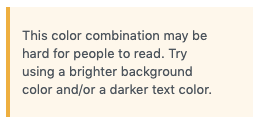
Ok, you say. That teal on gray color combination is not exactly great, but I can mostly make it out. (I’m glad one of us can, it’s pretty much a muddy gray mess to me.)

The contrast ratio for that fine piece of hypertext is 1.47:1

To arrive at that number we require the use of… mathematics, with a side of understanding the differences between human and computer vision.

I wanted a better understanding of what the contrast scores were actually checking. This journey taught me about the history of computer vision and a bit about biology, and gave me a small review of some mathematics I haven’t touched since college.

I think I’ll just let the computer do the math for me from now on. Trying to work out the details step by step on paper/with a calculator gave me a couple weeks of frustration. It was a lot of me figuring things out wrong, and comparing to the end result of existing contrast checkers.

Remember how the teachers’ in school always wanted you to show your work, ie, how you got to the answer? I made something to help us out.

If you view this on codepen with the console open, I output results step by step there, where I initially worked out the math before displaying things in the fun retro video game style. Go ahead, try our two example colors: 1ABC9C and 888888.

(You can also give it a try, inside this article, but you have more browser breathing room in a new window. Your choice! )

See the Pen Understanding the Contrast Ratio by Stacie (@Metahari) on CodePen.0

The digital devices around us make gamma encoding and decoding calculations all the time, to show us things on the screens that match up to our perception of how things appear to our eyes.

I just want my page to have proper contrast, what do I do?!

There are a variety of accessibility resources that you can can audit your site.

First, identify areas that are not serving your accessibility needs.

Small snapshot of the top of the WAVE tool results, showing the 3rd button, contrast, selected.
The third button at the top of the WAVE sidebar results shows contrast related results.

Use free tools Google’s Lighthouse Audit or the WEBAIM WAVE tool have places to identify contrast errors (along with other helpful accessibility tips).

Then, follow the suggestions of the audit and use best practices to improve your scores, and remove the errors.

Once you identify contrast errors you can try out some different options right there in the WAVE tool, click on the color box to pop open a color picker. Then play around until the errors go away, and you’ll know what you can replace in your code.

To finish, run the tests again to make sure your changes improved things. Congratulations! You just made your product better for all users, not just ones affected by the accessibility errors!.

After all that, what comes next is up to you!

You can make it easier on yourself and start all new products with the goal of making them accessible. Make accessibility guidelines part of your requirements for both technology AND design. You’ll save yourself potentially hundreds of hours of remediation, and related legal complaints.

US government/education websites are required to comply, but other industries are often taken to task for not making their sites equally available for all people.

If you have the option, consider using established and tested frameworks and web libraries (like Twitter’s Bootstrap or Google’s Material Design) that have already figured out optimum contrast theme colors. In many cases you can take just what you need (the CSS) or at least review their color palettes to inform choices.

Derek Kay has reviewed a list of web frameworks with a focus on accessibility, which I suggest you read if you are looking for more options.

The US Web Design system shows one way to solve color/contrast puzzles (ie, use their css token system that labels colors to make contrast differences super clear) but they also link to several very good resources for improving and understanding contrast.

We took a deeper dive here than you ever really need to know when you just want to do is fix your contrast issues, but understanding what the ratio actually means should help you remember to keep contrast in mind when designing future sites, web apps, and other software.

I’m not the ultimate subject expert, just a very very curious girl, who sometimes has issues reading things with low contrast. If you have any additional thoughts, corrections or further research to share, please leave a comment and I’ll amend this article, or the example. Thanks!

The Grid – v2 – impressions

Version 2 of the Web Interface to use the Grid is live. as are my struggles to co-exist with Molly, the AI that runs theGrid.

Examples

First, check out 2 grid sites I’ve created:

TLDR:  I’m not happy with v2. 

I’ve been working on this post for almost a year, I don’t want to bother with more screenshots or examples. v3 should be on its way shortly. I’m posting this now so I can compare my v2 thoughts vs v3. I did purchase a lifetime membership, so I haven’t given up on thegrid, fwiw.

To make my art-portfolio grid site present mostly the way I want, I’ve pretty much resorted to just importing Instagram posts.

Checkout my wishlist items for V3 on my second grid site.

~~~~~~

User Interface

The Backend User Interface is… clunky.It does look more polished than the beta version, and has some pretty animated menus, but it’s also less clear on how you and the AI work together to make a page.

!) The new site dashboard wastes a whole screen of real estate.

Large screenshot showing almost nothing above the fold.


2) Post ordering does not place the latest post at the top, and while you can drag and drop items to move them around, I can see this easily becoming onerous with 3 dozen or so images or posts.  You can actually zoom out the thumbnail views for easier drag and dropping, but there is no only text version to help you.

A little investigation has shown that the AI does not read the content or title of your posts, and no way to force thegrid to sort items on either the backend, or exposed as a feature for the front end.  No way except to drag and drop the articles back in order.

Posts with images in them do tend to stay in the same order as listed.

Search

There is no search option for either the front or backend.

Navigation

There are more navigation varieties this time around, so that’s nice, but rarely surprising.

Some of the options are ones I would never use, so I have to keep hitting redesign until I get one that’s ok.


Grid Font strangeness

Typography

Typography is strange, sometimes fonts are larger when placed next to similar designed smaller fonts. This example is using 2 links to two separate pages (same thing, shown differently, beside itself)

Additionally, every page load/reload seems to suffer from a CSS Flash of Unstyled content, which means the text/page jumps around a bit until it figures out what font style/sizes should be.


Redesign Process

This whole process irks me. We’re asked a series of questions everytime we ask for a redesign.

The Layout: Do you like it?

(where 1-3 means redesign, and 4 and 5 mean…)

The color: Do you like it? 

Choosing 1-2 here will prompt you to choose another color palette

Typography:

Molly.AI is supposed to be able to identify what parts of an image are important. Faces, skylines, or text text should not have text overtop of them, similar rules apply to cropping. This seems to be hit or miss. We used to have a quick key to check to see what part of the image the AI thought was the focus.

I’d be ok if you could at least click on the text overlay and see the original, or uncropped version.

Yes, you do have options to turn off the cropping, overlays and color manipulation. I want to see theGrid do things with the design that I wouldn’t have thought of, colors, layouts, navigation.

I’ve made a wishlist of things I want Molly.AI to be able to do, and put it on my Ghost In The Well grid site, but I’m going to copy it here as well (the flexible updating wishlist will stay on that site.

But, as of now here it is:

Regarding Function

  • Have a media manager, so I don’t need to upload the same image more than once. (confirmed for V3)
  • Iterate designs much faster, allow me to give input.(coming in v3?)
  • Auto pull in feeds of my other sites or social networks. (Instagram/twitter – perhaps into my drafts mode so I can curate later?)
  • Give Molly some initial direction in the purpose of my site. (maybe in v3)
    • Or, enter content and have Molly intuit, summarize and categorize what I may want the direction to be. (this feature may become the clustering idea and may be in v3)
  • Really surprise me
    • Design some crazy bad things
    • Design some crazy good things
  • Allow for tagging of posts
  • Have option to attach the user profile/sig to appropriate article.
  • Date and Time stamps available to be included on the posts.
  • Add Accessibility warnings for color/font choices.
  • Ability to pin certain articles or objects to the top of the homepage
  • Choice of different sizes for headers images/videos (both in app and on site) Currently wasting space ‘above the fold’
  • Ability to merge posts together

Usability:

  • Add settings/preferences for the admin experience. IE color theme/font sizes, animations on or off.
  • Add Revision history. Date/time/last edited by which user information.

The Grid – Beta

Have you heard of The Grid, an AI that builds your website?

They have an impressive demo video, and a strong marketing strategy.

I made it into the beta early, and have been able to start poking around with both the documentation and the site builder apps.

I’m intrigued…

There are a lot of things going on under the hood.  The system is analyzing my photos, adding color filters to match my branding (which was in turn created from the system analyzing a picture I chose, in the first place).  Then it attempts to place title text in places that don’t overlap important parts of the images.  You make a few other choices, layout, type formality and then the AI builds you a site.

It’s a bit of trial and error now, and the tech bits seem more mature than the user interface. That jives, the system does work, but it’s a bit difficult to figure out how to ‘make it go.’

It’s beta, things like the on-boarding of new users, tutorials and walk-throughs are pretty light on info.

but that’s part of the adventure, right?

There have provided a lot of API documentation, sites live on thegrid.ai and the files live github folders.

It’s not a magic bullet, someone will still need to make some choices about the direction of things, even when the AI has a better idea about what successful sites look like and operate.

But, I think it’s a step in the right direction, and every time the AI learns a new trick it goes through all sites and republishes them, making better choices.

That kind of thing will keep things fresh, evolving, and hopefully – eventually engaging.

It’s going to be a little while before truly professional/beautiful sites just ‘happen’ through the grid. I’m more than willing to wait to see where this takes web design and development.

Questions:

How do I sync my website/twitter feed/other RSS feeds to my grid site?

I see something in the documentation, for the API, about how to write ruby/python/ect to link feeds in, but this seems like a standard base requirement that many grid sites will be looking for.

Why doesn’t theGrid chrome extension or the IOS app use the application token authorization for apps I’ve already logged in to/authorized.

Good that it uses the twitter account from IOS, bad that all other accounts (g+. Facebook, ect) it sends me to a login screen even if I have an app open and logged in already.

Why does my grid extension have two share options when I right-click on something to share to the grid?

They both seem to work.

Oversharing.png

ok, a day after grabbing that, it’s working properly, glitch or fix, it’s better:

Screen Shot 2016-02-18 at 4.00.46 PM

It seems like the company, like their AI, is iterating features/improvements daily.

Why is the ‘Review Design Changes’ page bright yellow?

blindedbytheyellow
New Crayola color:  ‘Augh My Eyes! Yellow’

Every other page of the grid on the app or in the chrome extension is dark gray, soothing to the eyes and not a bright hazardous  yellow background?

I shared a post that seems to mysteriously be shrinking with each iteration.

The fonts for those 2 posts are pretty much unreadable unless I look at the responsive phone sized version. This may be an @media size issue. If I make the browser window larger or smaller, the font sizes become readable again.

What does the AI see as a ‘Successful’ design/iteration?

I’d love to see 6 possible designs that the AI discarded in favor of the one I get.

I’d love a mode where I can thumbs up or rate the results when I get them. I want to help train the system!

A feature I’m looking forward to is focused ‘purpose‘ options. The company has spoken about how choosing purpose categories like ‘sales‘, ‘newsletter sign ups‘, or ‘increase social exposure‘ will help influence how the system makes some design choices.

Could the Grid AI start to learn my personal preferences as well as successful designs over all?

We’ll find out as the year progresses. I’ll post a link to the sites I’m experimenting on when I have more time to play.

Stay tuned

Sublime Packages

Hey, Sublime Text 3 has a new build version out! #3103 /kermit arms.

That makes this the perfect time to talk about my favorite customizations for it – Packages!

Sublime packages are a little like after market mods for your car. Or plugins. Either way they improve the usability and can do things like change the color of the interface or check your code for you.

First: Start off with the package installer, called Package Control.  https://packagecontrol.io/installation

Here are a few useful packages I have installed:

Themes

Do you have any packages that you’d recommend?

Why I <3++ Slack

Brief Intro to Slack

I’m a happy user of Slack, using it for the Madison Cartoonist Conspiracy art group, various classes and professionally.

I’m always astounded when people still haven’t heard of or used it, so I started keeping a list of links to share/email.  I think I’ll just refer to this post from now on, adding useful links as needed.


What is Slack?

https://slack.com/

How can teams use Slack?

https://slack.com/is/team-communication

WordPress.org uses Slack as their primary collaboration tool for their open source work.

Join WordPress Slack

There are many integrated services and apps that work with Slack.

https://slack.com/apps
Additionally, they have an excellently documented api
https://api.slack.com/slack-apps (for making an app that works with Slack)
https://mc-web.slack.com/apps/build/custom-integration (for making a custom connections)

Joey Day used the custom integration to hook slack up with Service Now ticket management system. (but you can link Jira or Zendesk too)

http://joeyday.com/2015/03/02/integrating-servicenow-with-slack/

Here is a case study of a small company who now uses Slack

http://slackhq.com/post/117188698390/picking-up-slack-at-panic

MF has some tips for using Slack/

http://ask.metafilter.com/267742/Tips-and-tricks-for-using-Slack

Some other tips

http://www.fastcompany.com/3046011/know-it-all/best-practices-from-the-most-active-slack-users

Other reading