Version 2 of the Web Interface to use the Grid is live. as are my struggles to co-exist with Molly, the AI that runs theGrid.
Examples
First, check out 2 grid sites I’ve created:
TLDR: I’m not happy with v2.
I’ve been working on this post for almost a year, I don’t want to bother with more screenshots or examples. v3 should be on its way shortly. I’m posting this now so I can compare my v2 thoughts vs v3. I did purchase a lifetime membership, so I haven’t given up on thegrid, fwiw.
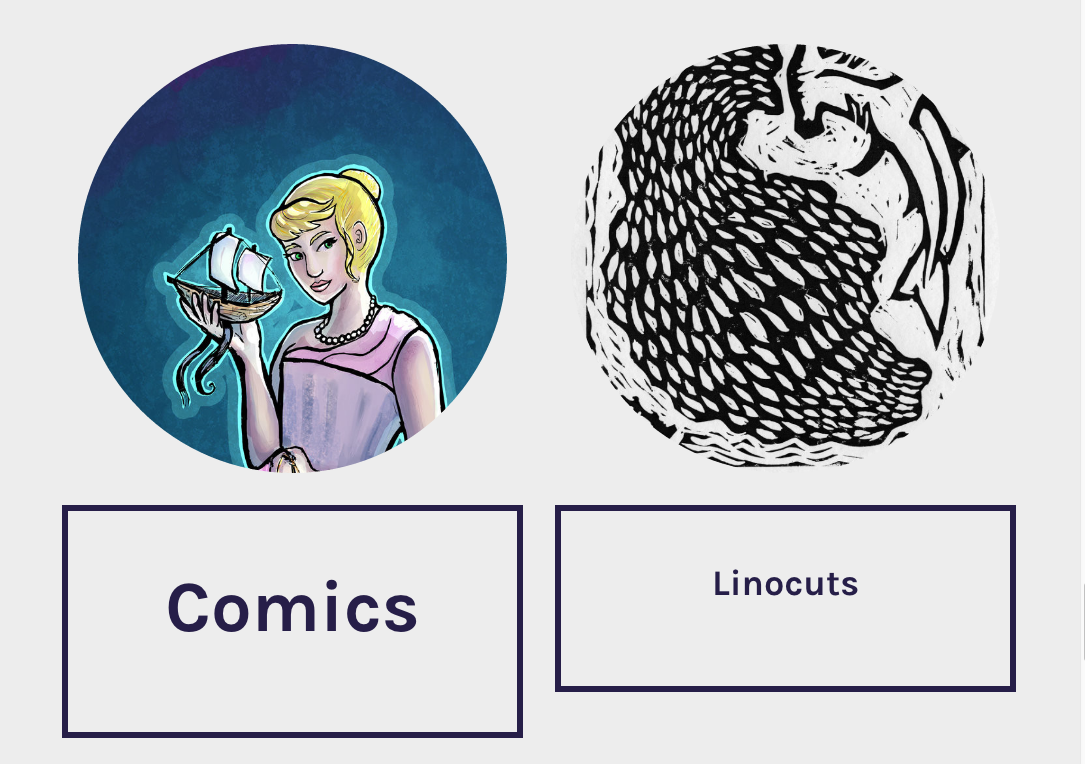
To make my art-portfolio grid site present mostly the way I want, I’ve pretty much resorted to just importing Instagram posts.
Checkout my wishlist items for V3 on my second grid site.
~~~~~~
User Interface
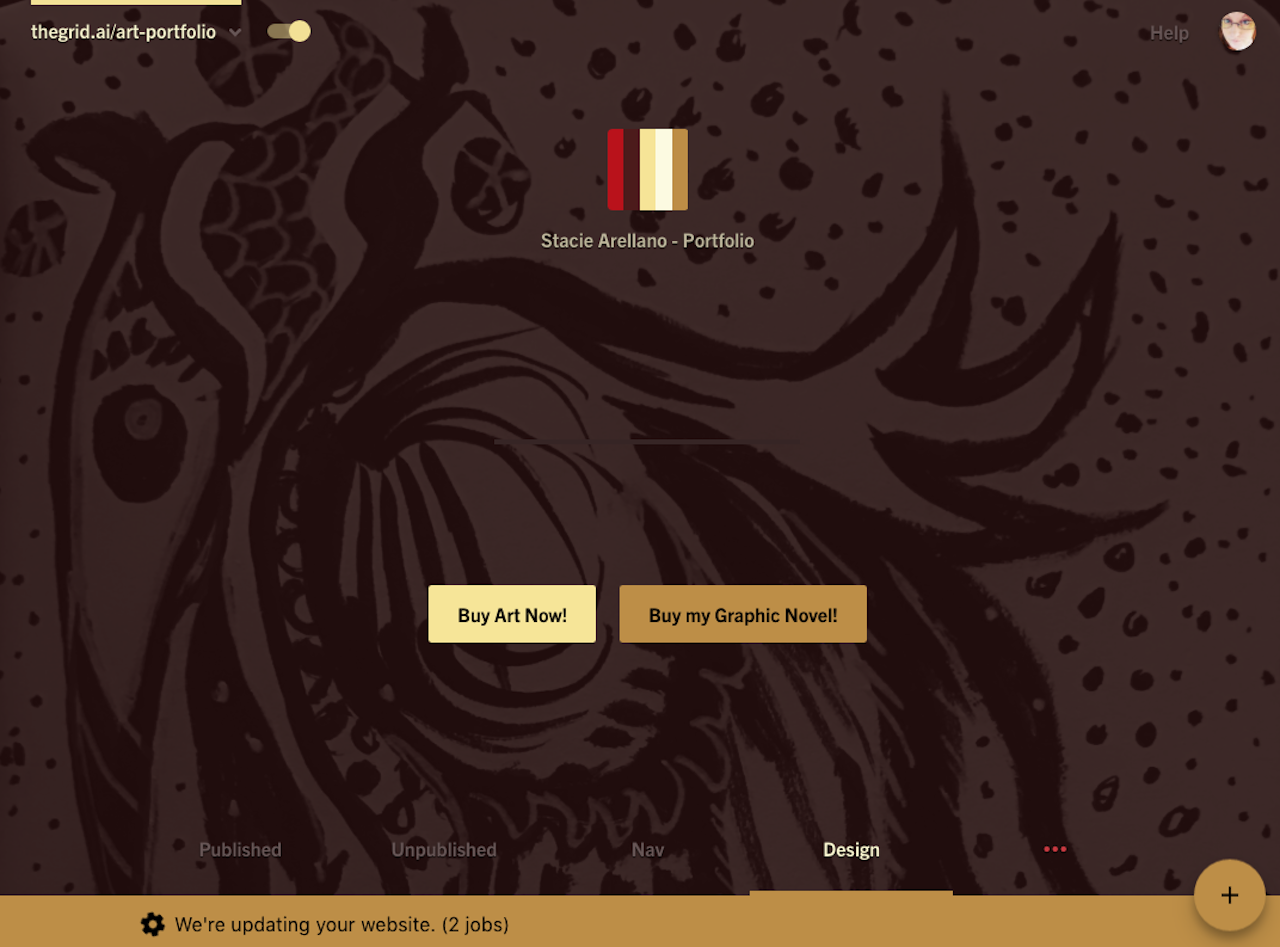
The Backend User Interface is… clunky.It does look more polished than the beta version, and has some pretty animated menus, but it’s also less clear on how you and the AI work together to make a page.
!) The new site dashboard wastes a whole screen of real estate.
2) Post ordering does not place the latest post at the top, and while you can drag and drop items to move them around, I can see this easily becoming onerous with 3 dozen or so images or posts. You can actually zoom out the thumbnail views for easier drag and dropping, but there is no only text version to help you.
A little investigation has shown that the AI does not read the content or title of your posts, and no way to force thegrid to sort items on either the backend, or exposed as a feature for the front end. No way except to drag and drop the articles back in order.
Posts with images in them do tend to stay in the same order as listed.
Search
There is no search option for either the front or backend.
Navigation
There are more navigation varieties this time around, so that’s nice, but rarely surprising.
Some of the options are ones I would never use, so I have to keep hitting redesign until I get one that’s ok.
Typography
Typography is strange, sometimes fonts are larger when placed next to similar designed smaller fonts. This example is using 2 links to two separate pages (same thing, shown differently, beside itself)
Additionally, every page load/reload seems to suffer from a CSS Flash of Unstyled content, which means the text/page jumps around a bit until it figures out what font style/sizes should be.
Redesign Process
This whole process irks me. We’re asked a series of questions everytime we ask for a redesign.
The Layout: Do you like it?
(where 1-3 means redesign, and 4 and 5 mean…)
The color: Do you like it?
Choosing 1-2 here will prompt you to choose another color palette
Typography:
Molly.AI is supposed to be able to identify what parts of an image are important. Faces, skylines, or text text should not have text overtop of them, similar rules apply to cropping. This seems to be hit or miss. We used to have a quick key to check to see what part of the image the AI thought was the focus.
I’d be ok if you could at least click on the text overlay and see the original, or uncropped version.
Yes, you do have options to turn off the cropping, overlays and color manipulation. I want to see theGrid do things with the design that I wouldn’t have thought of, colors, layouts, navigation.
I’ve made a wishlist of things I want Molly.AI to be able to do, and put it on my Ghost In The Well grid site, but I’m going to copy it here as well (the flexible updating wishlist will stay on that site.
But, as of now here it is:
Regarding Function
- Have a media manager, so I don’t need to upload the same image more than once. (confirmed for V3)
- Iterate designs much faster, allow me to give input.(coming in v3?)
- Auto pull in feeds of my other sites or social networks. (Instagram/twitter – perhaps into my drafts mode so I can curate later?)
- Give Molly some initial direction in the purpose of my site. (maybe in v3)
- Or, enter content and have Molly intuit, summarize and categorize what I may want the direction to be. (this feature may become the clustering idea and may be in v3)
- Really surprise me
- Design some crazy bad things
- Design some crazy good things
- Allow for tagging of posts
- Have option to attach the user profile/sig to appropriate article.
- Date and Time stamps available to be included on the posts.
- Add Accessibility warnings for color/font choices.
- Ability to pin certain articles or objects to the top of the homepage
- Choice of different sizes for headers images/videos (both in app and on site) Currently wasting space ‘above the fold’
- Ability to merge posts together
Usability:
- Add settings/preferences for the admin experience. IE color theme/font sizes, animations on or off.
- Add Revision history. Date/time/last edited by which user information.